
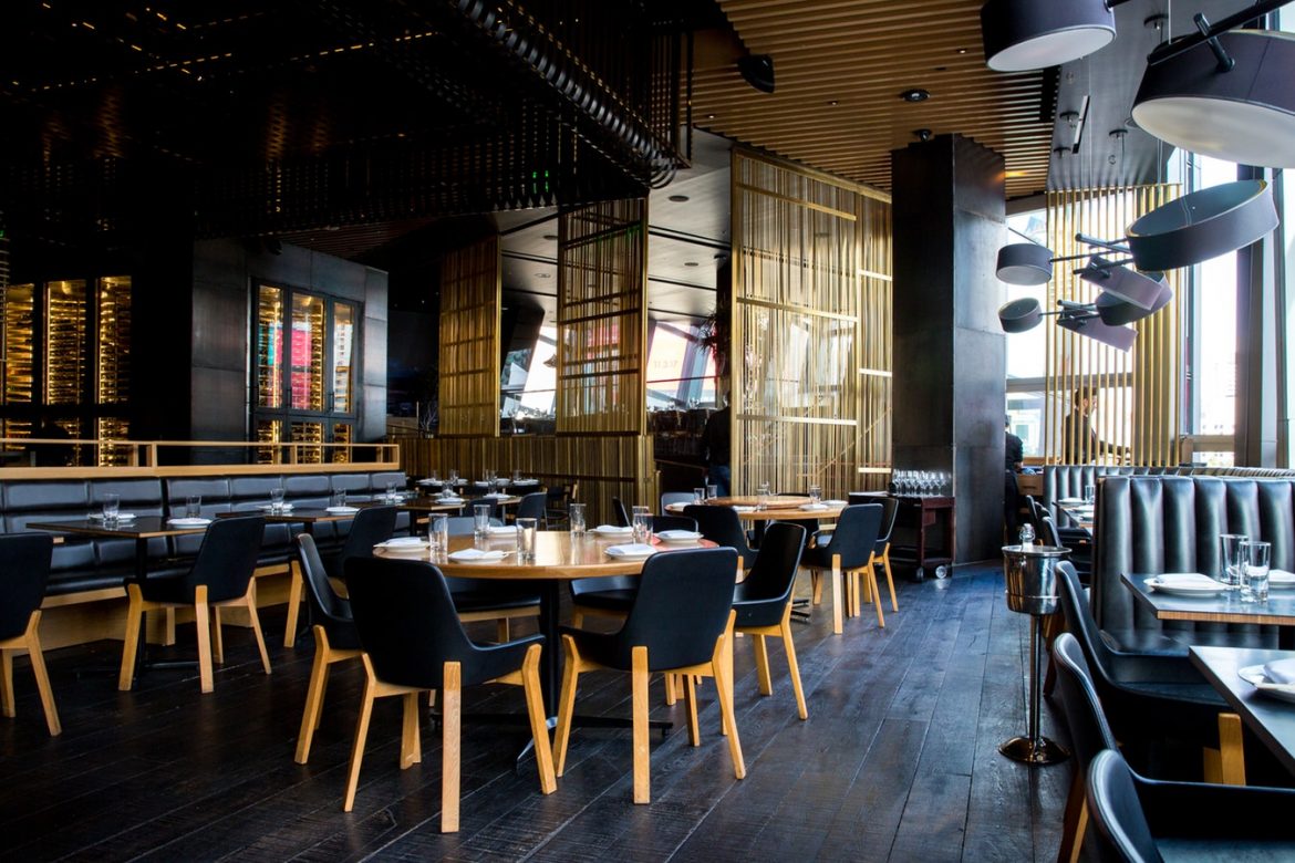
Colours have a significant impact on people”s dining behaviour. When deciding on your restaurant”s interior design, you will want to use colours that can set the right mood for patrons to eat and drink- even if it means abandoning your favourite colours. While we know that some theories seem outdated and clichéd, certain colours can still be said to be more appetising than others. When working on the décor of your restaurant, keep in mind what you would like your patrons to do and feel- which colours will be best for that? Do you want your clients to:
- Eat quickly and walk out?
- Stay longer, eating and drinking?
- Have a serene and romantic evening?
Here are some colour suggestions:
Green
Green colour is usually associated with nature. You will find many health food establishments using a blend of green  and earth tones to draw this connection. This apparent connection with nature is also the reason why diners generally feel relaxed in a green-coloured restaurant- they tend to believe that the food there is fresh and healthy.
Yellow
Yellows tend to be irritating and that”s why they are ideal for fast-food restaurants to ensure that patrons eat and leave quickly.
Blue and Purple
You have probably heard that blues and purples have a connection with toxic substances. This is true. As a matter of fact, you will not find many natural foods in blue or purple, and that why these colours don”t evoke hunger. If you”re running a spa or gym, you may want to use blues and purples to create a bohemian feel. What all this means is that you will need to reconsider these colours when running a restaurant.


